Pilot Parallel Calligraphy Pen Review

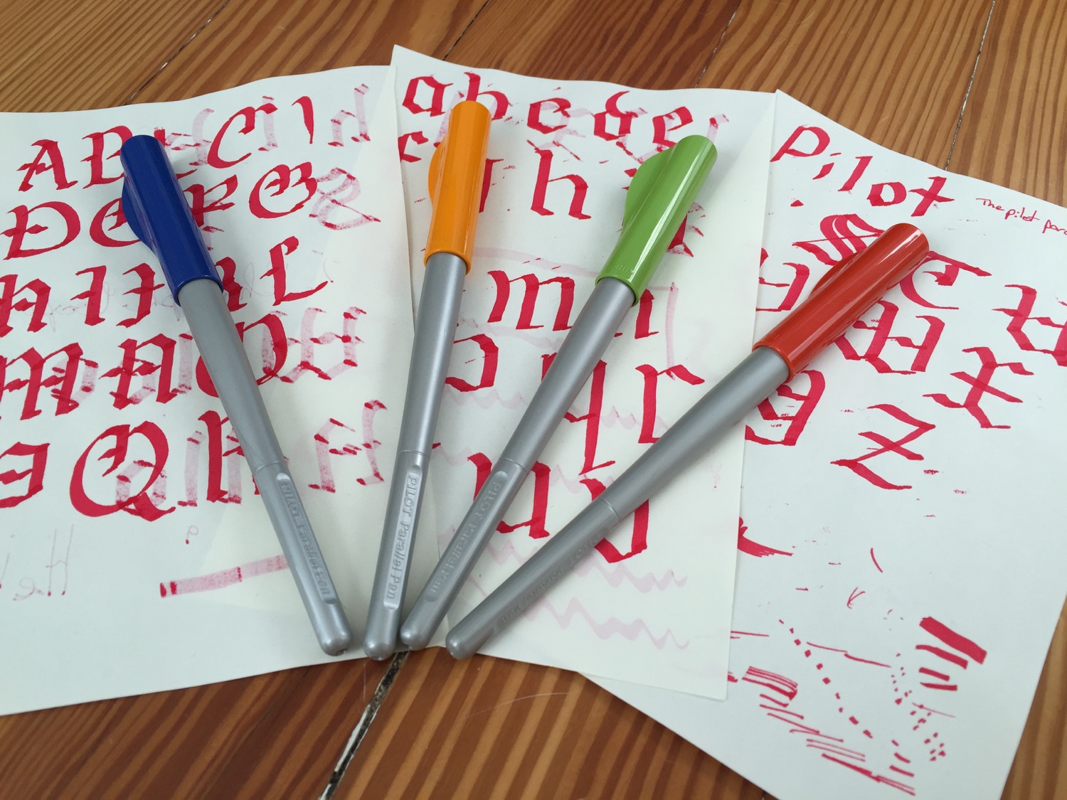
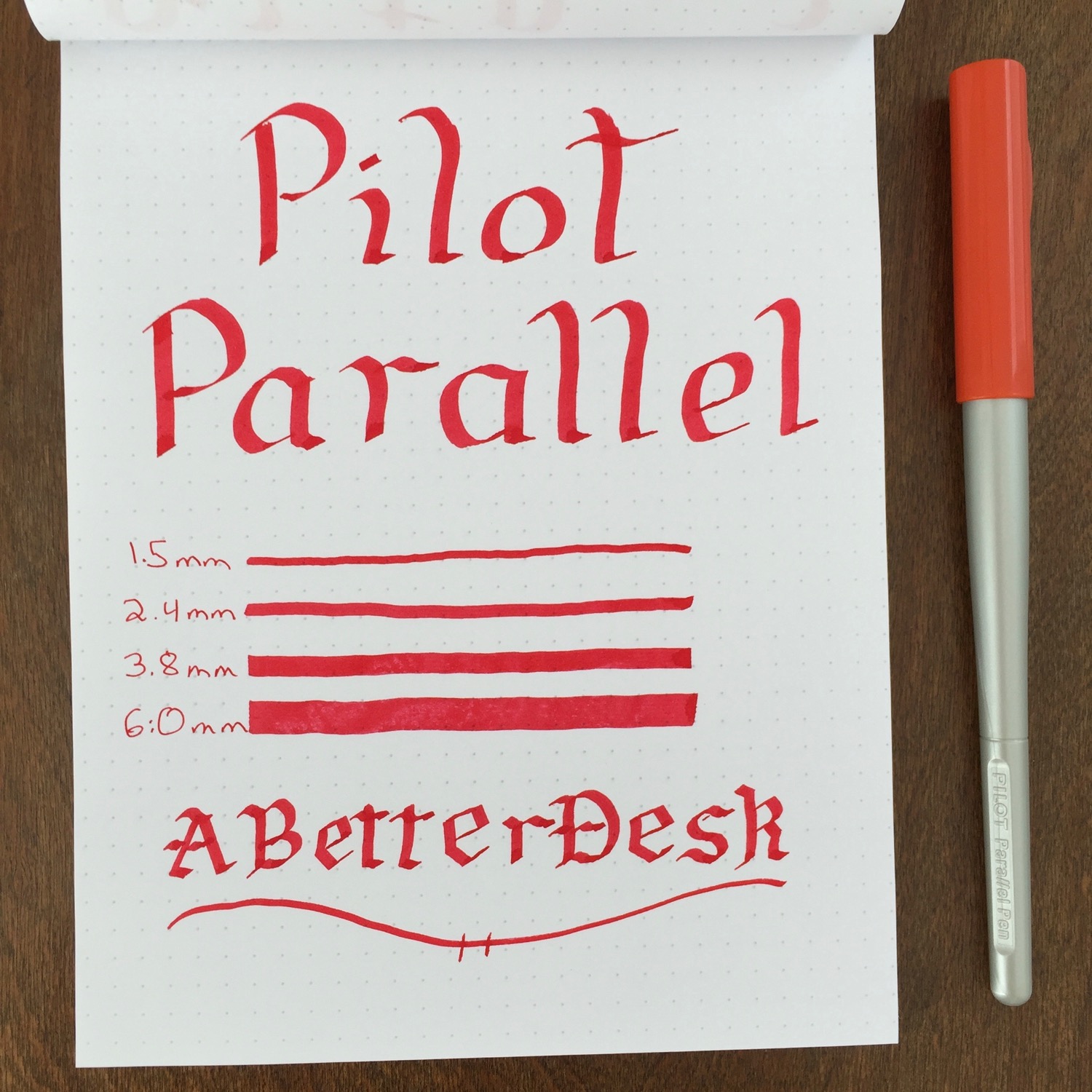
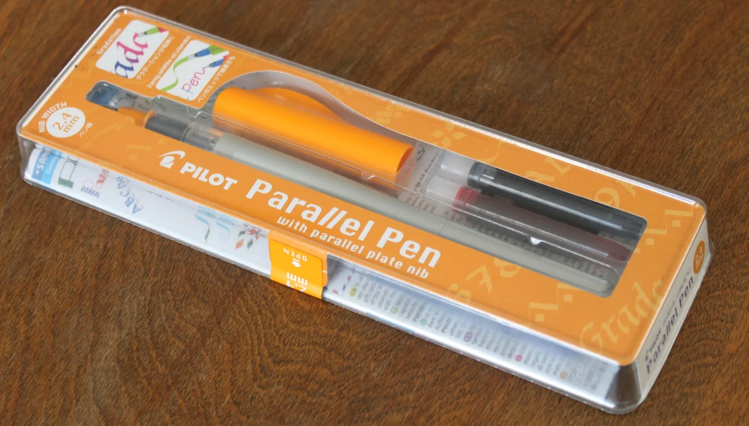
The Pilot Parallel is an inexpensive calligraphy pen that's great for getting started with calligraphy without spending a small fortune. I stumbled upon these pens while looking for a cheap pen for testing inks, and they are exactly what I was looking for. The full Pilot Parallel pen set can be found for less that $30 on Amazon and comes with four pens with 1.5, 2.4, 3.8, and 6mm nib sizes.

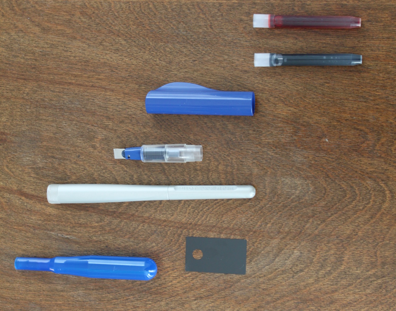
Each Pilot Parallel pen comes with two mixable ink cartridges, a nib cleaner, bulb syringe for cleaning, and calligraphy guide. The pen is made of plastic and twists apart for easy ink cartridge replacement, like most standard cartridge fountain pens. The Parallel's cap is threaded and caps securely. Its very lightweight plastic body lacks a clip and resembles a paintbrush handle. The pen looks and feels like a $10 pen, but its performance makes up for the cheap first impressions.

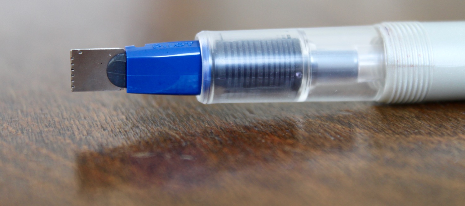
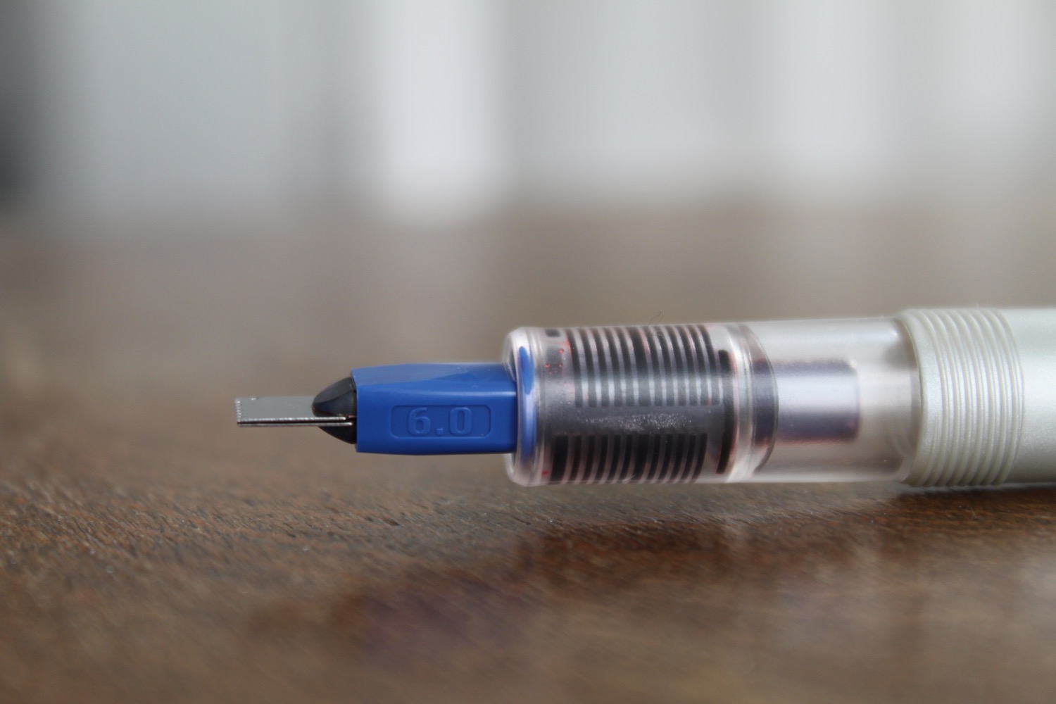
The nib of the Pilot Parallel is easily the most interesting part of the pen. The nib is made of two parallel plates, with serrated edges that allow ink to flow out of the tip of the nib. This varies from the standard fountain pen nib design, where the nib sits atop an ink feed that keeps the nib inked. It takes a bit of coaxing to get the ink to flow through the Parallel's feed at first, but the transparent feed gives a good indication of the ink's progress as it approaches the nib. I typically have to tap the nib on paper to get the ink flowing through all of the nib slits, but flow is steady once it gets going.

Pilot states that its Parallel pen is only to be used with the included calligraphy inks, which are very wet. I bought the pens for ink testing, so I was relieved to find that they work with with standard fountain pen inks as well. Wetter inks perform the most consistently, and dryer inks take a bit work to get them to flow through the nib. These pens lay a ton of ink on the page, so be sure to use a higher quality paper to reduce ink feathering. This also means that the pens burn through ink very quickly.

Instead of wasting money on a Pilot converter, I reuse the empty Parallel ink cartridges. These hold a large amount of ink and have a ball bearing agitator that keeps ink from building up in the tip of the cartridge. The cartridges are very easy to clean by flushing with a standard medical syringe. The Pilot Parallel can also be converted to an eye dropper filler with a huge ink capacity, since the body of the pen is sealed. I'm still not brave enough to try this, but it should be fairly easy to do by filling the pen body with ink and adding a bit of silicon grease to the threads for a good seal.

The Pilot Parallel comes with a sheet for cleaning the grooves of the nib as well as a customized bulb syringe for cleaning. The pens takes substantial flushing to clean, but the provided tools really help make the process easier.

I initially purchased a set of Pilot Parallel pens for ink testing, but I find myself dabbling more and more with calligraphy. These pens are a lot of fun to use and are so inexpensive that I have no qualms about throwing the pens in my bag or playing around with different inks. The 2.4mm pen is my favorite of the bunch, and the nib is just the right size for my A5 Rhodia DotPad and Midori Traveler's Notebook. The Pilot Parallel Calligraphy Pen is a fantastic find, and I'm glad that I gave it a shot.

Pilot Parallel Calligraphy Pen Handwritten Review.jpg

Like this post? Subscribe to our rss feed or follow us on Twitter and receive new post updates automatically.

New Year Resolutions and Course Corrections

With the move towards a digital world came the promise of efficiency and sanity. Endless file cabinets became bits on a hard drive and digital tags keep massive amounts of data sorted and easily accessible. We no longer have to remember to bring our address books to lunch, and working in the office transformed into working from home or a coffee shop. Reminders and calendars tell us exactly when we need to be where and what we need to do when we get there.

The problem with this sort of efficiency and flexibility is that the hours that we gain in spare time aren't spent in leisure; they're spent doing more work. Productivity and efficiency became standard operating procedure, but the eight hour work day never became the four hour work week that we were promised. Todo lists that once contained five items now contain fifty and have morphed into monstrous databases that are ever-present on our laptops and smartphones. Our calendars are triple booked, with bleeps and bloops reminding us that we should be doing more. This makes it more important than ever to find time to rest and time to question what's worth doing and what can be cut loose.

The end of the year is an excellent time to re-evaluate, clean house, and step away from the daily chaos, just for a little while. Of course, some might call these goals New Year resolutions, but the New Year is arbitrary. There are a few things that I'm trying to do this year to course correct; however, it's worth noting that any time of year can be your "New Year:"

  • Read, sort, and clean out all of my inboxes from digital to physical mailbox. Everything has a place, whether it be archived, moved to a todo list, or trashed.
  • Review all of the tasks that I keep in my task manager and decide what high-level tasks I want to accomplish in the upcoming year. Decide what's needs my attention and drop any tasks that I've been holding on to that I'll never do and won't derail any important projects.
  • Evaluate my mental well-being and set a few goals to improve it. I usually choose small goals that are easily achievable. This year's goal is to make a daily gratitude note in my Chronodex planner. I tend to focus on the negatives of life, and little efforts like these help me to shift my outlook towards the positive.

If you haven't already, treat yourself to a yearly review session. Grab a big cup of coffee, turn off all of those bleeps and bloops just for a little while, and take a look at where you've been and where you want to go.

Most importantly, remember to breathe. Thanks for your support this year, and I look forward to seeing you again in the next.


Like this post? Subscribe to our rss feed or follow us on Twitter and receive new post updates automatically.

Lamy 2000 Fountain Pen Review

Fifty years ago, Gerd A. Müller's creation was released to the world. This carefully-crafted fountain pen saw several small quality tweaks over the decades, but the pen of today is almost identical to the pen that debuted in 1966. How do I start a review of one of the most iconic fountain pens ever made? If you've found this review in your quest to learn more about the Lamy 2000, you already know that it's an excellent pen. Pen aficionados have reviewed this pen extensively, so what could I possibly have to add? All that I can offer is the perspective of someone who purchased the Lamy 2000 as his first gold-nib fountain pen. This isn't a pen that I purchased to sit on a shelf after a few weeks. This is a pen that I purchased to use daily, carry to meetings, ride around in my bag, and serve as my or maybe the pen. If you're in search of the same thing, I hope that this review can be of some help.

Lamy 2000 Glow.jpg

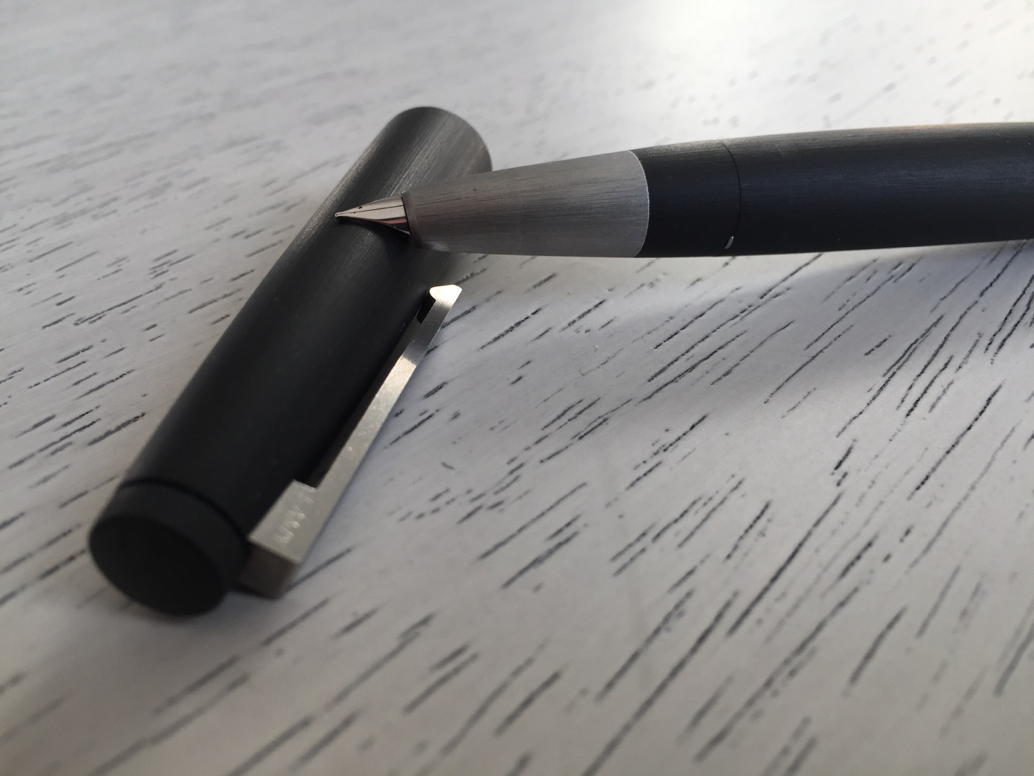
The Lamy 2000 photographs terribly, which is a complete disservice to the pen's beautiful finish. The pen's makrolon body and stainless steel grip both have a brushed finish, and the body tends to have a shininess in photos. In person, the makrolon body has more of a matte finish, and it's much more attractive. The grip of the Lamy 2000 is something special, and it's hard to describe the distortion effect that the brushed finish has on the stainless steel surface. The pen's grip actually appears to glow under certain types of light.

There are three barely-visible seams on the Lamy 2000's body. There's a tiny seam at the end of the pen, where the piston knob meets the pen body, and there's another seam where the pen cap can be twisted off for cleaning. This seam also holds a small o-ring in place, and the teeth of the o-ring serve to grip the cap when the pen is capped. The final seam is a pseudo seam between the stainless steel grip and makrolon, which can't be twisted apart.

The makrolon body of the Lamy 2000 is almost soft to the touch, which is hard to believe without handling it. The brushed texture is velvety and serves to grip to the fingers as the pen is used. The body of the pen has a slight bulge in the middle and tapers evenly on each end, somewhat reminiscent of a blimp.

The Lamy 2000 uses a piston filling mechanism, which is a departure from the cartridge and converter pens that make up the lower end of the Lamy product line. The pen is very easy to fill. Twist the piston knob out, submerge the nib into your favorite bottle of ink, past the air hole on the grip, and twist the piston knob back into place. Piston fillers hold much more ink than their cartridge counterparts, and the Lamy 2000 is no different. I use the 2000 as my daily writer, so ink capacity is important. The best part of the pen's piston system is that it practically disappears when not in use. The seam between the piston knob and pen body is barely visible, when tightened.

Notice the air hole? This is where the pen draws in ink. Also, this photo does a pretty nice job of showing how the metal grip seems to glow in certain types of light.

Notice the air hole? This is where the pen draws in ink. Also, this photo does a pretty nice job of showing how the metal grip seems to glow in certain types of light.

One of the worst parts of using fountain pens is running out of ink on the go. It's not exactly easy nor smart to carry around a bottle of ink in an everyday carry bag. The Lamy 2000 has a subtle ink window that notifies the user of low ink levels with plenty of time to spare. At first, the ink window seems pretty useless, and most may even fail to notice it at first glance. Once the ink levels are low enough something magic happens, and the ink window becomes see-through. This is another great example of how the best features of the Lamy 2000 disappear until they are needed. There is a generous amount of ink mileage between an empty ink window and a dry nib, so there is plenty of time for a refill.

I typically rely on a bulb syringe for cleaning cartridge fountain pens, so the design of the Lamy 2000 causes some challenges. I watched a few YouTube videos that show how others clean their Lamy 2000s, but I'm just not willing to twist this pen apart. It's best not to overcomplicate the process by disassembling the pen, since one wrong move may result in permanent damage. Simply flush the pen by pulling clean water into the ink chamber and pushing it out five to ten times. Sit the pen nib down in a glass full of fluffy paper towels, and allow it to dry overnight. Goulet Pens also published an easy way to grease the piston, if it becomes stiff over time.

The Lamy 2000 can be posted, but I think that unposted is the only way to go. While the cap is snug when posted, it rests primarily on the piston knob, which can cause the knob to rotate as the cap moves in the web of the hand. There have been a few occasions where this has caused some ink leakage, so I avoid posting altogether. If posting is vital, pressing the cap down very tightly causes it to grip to the pen body as well, reducing the chances of an inky disaster. Considering that the designers seem to have perfected every inch of this pen, I'm surprised that something so basic as a proper post has been overlooked entirely.

There are several tiny protruding teeth, slightly above the grip section of the Lamy 2000 which help the cap to snap into place. I barely notice these teeth, even thought they are located exactly where I grip the pen. The pen caps with a satisfying click, although the cap takes an odd amount of force to cap down onto the pen. It feels as if the metal grip is grinding against the inside of the cap. Realistically this isn't causing any damage, but it's not a pleasant feeling. Fortunately, this becomes better with usage. The capping and posting experience is easily the worst part of using the Lamy 2000.

Lamy 2000 Cap.jpg

Despite my lack of enthusiasm for the pen's cap and post performance, the Lamy 2000's clip is excellent. The clip is spring-loaded, making it easy to clip the pen securely on items of various thicknesses. This clip itself is wider at the top of the cap and thinner towards the base, which gives the cap a sleek and timeless look. The clip is a solid piece of metal and is thicker and more robust than any of the clips on my other pens.

Lamy 2000 Pen Clip Side.jpg

The Lamy 2000 is a popular choice for those seeking to break the gold-nib barrier, and I have to admit that it's my only gold-nib pen. It's important to point this out, because my approach to this review is as someone who has never experienced a gold nib before.

The gold nib on the Lamy 2000 is understated, with no fancy engravings or flourishes. The nib is semi-hooded, which means that part of the nib is recessed into the pen's body. This helps to keep the nib moist when the pen is uncapped, but it also brings the nib in line with the pen's sleek design. Where most nibs protrude prominently from a pen's body, the Lamy 2000's nib becomes a part of the design, as if to say "I'm meant to be here." It extends the tapered shape of the body and is platinum coated, so it blends into the stainless steel grip.

Ok, so it looks good. You've rambled for 1000 words already, but I just want to know how it writes!

The Lamy 2000's nib is the smoothest nib that I own. The nib floats across paper with ease, and it's possible to write with very minimal pressure. Like most gold nibs, the 2000's nib flexes with pressure, resulting in a nice degree of line variation. Even though there is some flex, the nib is firm enough to use as an everyday writer.

I agonized for days over whether to choose an extra fine, fine, or medium nib. I ultimately picked the fine nib and have zero regrets. I usually write with fine-nibbed pens, and the Lamy 2000's fine is very similar to that of the Lamy Safari. The Lamy 2000 does lay down a much juicier line than the Safari, which can be a negative for those looking for fast dry times. I find that the juicy line brings out the color properties of the ink, which is apparent when comparing the Safari's nib with the 2000's.

Notice the difference between the Lamy Safari (Top) and Lamy 2000 (Bottom)? Both are using the same Aurora Blue ink, but the Lamy 2000 leaves a much juicier more vivid line.


Notice the difference between the Lamy Safari (Top) and Lamy 2000 (Bottom)? Both are using the same Aurora Blue ink, but the Lamy 2000 leaves a much juicier more vivid line.

The Lamy 2000 is rumored to have poor nib quality control. Although the 2000 is available on Amazon for 125$ or so, I chose to pay a little more and bought the pen on Pen Chalet. Pen Chalet has excellent customer service, and I wanted to make sure that it would be as painless as possible to return a faulty pen. I've had zero issues with my pen, and it has written perfectly since my very first use. It appears that the quality control issues are more fiction than fact, but I don't regret paying a bit more for the peace of mind.

Although the Lamy 2000 is a superb writer, its nib does have a sweet spot that could be confused for a quality control miss. Rotate the pen slightly, and the ink flow comes to a halt. It's very easy to avoid this issue when using a standard grip. Since most fountain pen nibs protrude, it's easy to tell when the nib is positioned correctly on paper. I don't think that the Lamy 2000's nib is any more or less responsive than other nibs; it's minimal design just makes it harder to tell when it's positioned properly.

The Lamy 2000 is a truly remarkable pen. Its fifty-year-old design still looks modern and edgy, and I'm sure that it will look just as edgy in fifty more years. The pen's features, from the ink window to the piston knob, only appear when needed and then vanish into the pen's brushed body. The Lamy 2000's gold nib, perfect weight, and brushed body combine to form the best writing experience that I've ever had. If you've stumbled upon this review because you're on the fence about this pen, go ahead and buy it. I spent several months reading reviews and none of them seem to do the pen justice, now that I have it in my hand. Aside from the functionality of the Lamy 2000, its history is something special. While I love my TSWBI, Kaweco, and Pilots, this will be the pen that I pass down to my children. In a world of throwaway things, this is a pen that is truly built to last.

Typically I would end the review here, but I wanted to point out a few resources that were very helpful to me when researching the Lamy 2000.


Like this post? Subscribe to our rss feed or follow us on Twitter and receive new post updates automatically.

Aurora Blue Ink Review

Blue is the perfect color with which to welcome the winter winds. Lamy blue/black ink cartridges have been the only blue in my arsenal, but November's Ink Drop brought an icy alternative to my door.

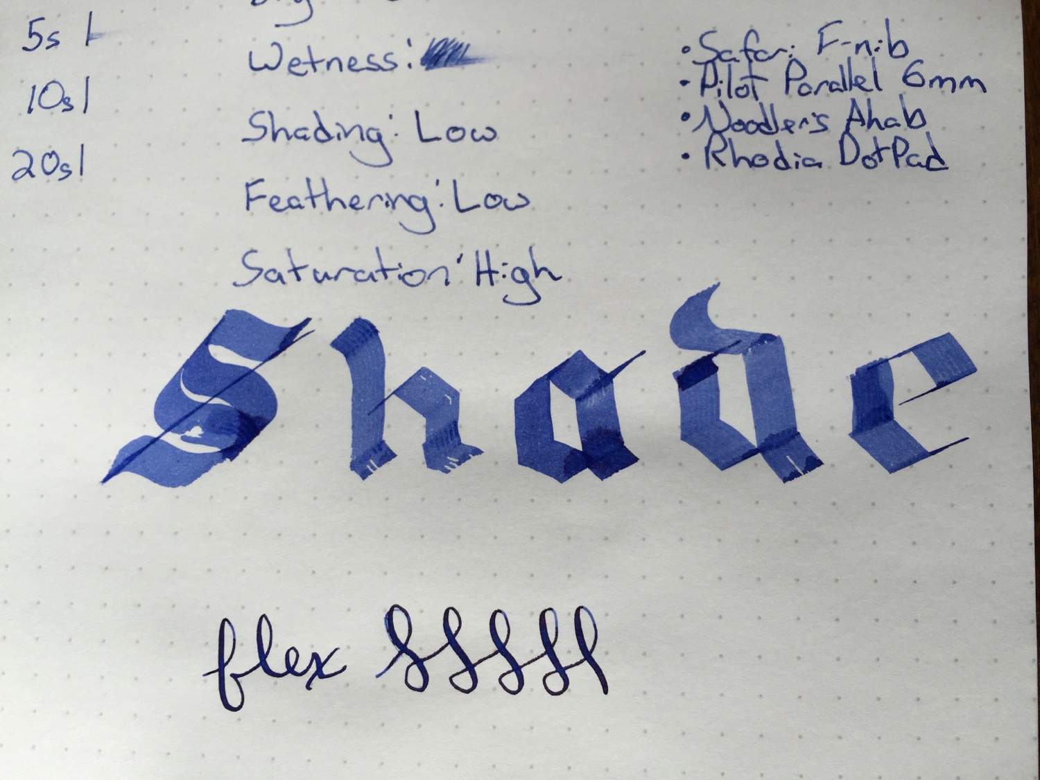
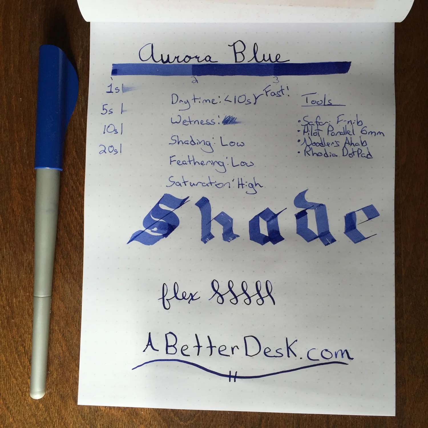
Aurora Blue is a beautiful deep blue ink, and its color deepens in intensity with every pass of the pen. I've been looking for an everyday blue bottled ink, and I think that this may be the ink for me. I use the Tomoe River Paper Midori refill as my primary notebook, and this paper has a notoriously long dry time. The benefits of using this paper outweigh the cons, but this means that I need inks with the best drying performance possible. I struggle with the slow dry time of my goto Diamine Onyx Black, so I'm pleasantly surprised to see that Aurora Blue has much better dry time than Onyx Black. Goulet Pens lists Aurora Blue ink as having a very slow dry time, but I found the opposite to be true. I did notice that it took a few minutes for the ink to dry with my Noodler's Ahab flex pen; however, dry time with the Lamy Safari F nib was less than 10 seconds for several different paper types. Dry time was less than 20 seconds on the Tomoe River paper, which is incredibly fast, compared to other inks.

I plan to load my sample of Aurora Blue into my Lamy 2000 and give it a go as my primary ink for the next few weeks. It's just that good.

Stats

  • Dry Time: Less than 10 seconds
  • Wetness: Wet
  • Shading: Low
  • Feathering: Low
  • Saturation: High

Tools

  • Lamy Safari - F nib
  • Noodler's Ahab - Flex nib
  • Pilot Parallel - 6mm nib
  • Rhodia DotPad

Like this post? Subscribe to our rss feed or follow us on Twitter and receive new post updates automatically.

The Chronodex and My Search for Sanity

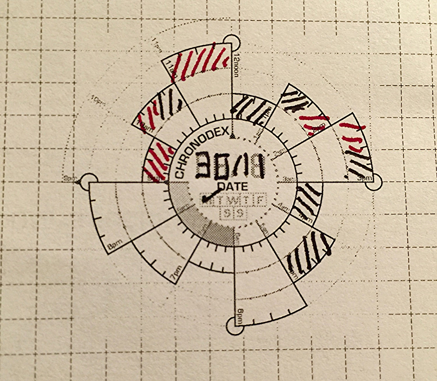
I stumbled upon Patrick Ng's Chronodex system while researching the Midori Traveler's Notebook. This little paper template has changed the way that I work. The system is simple, with 24 hours divided into a clock-like spiral. The layered spiral makes it possible to capture both AM and PM in a very compact space. An entire five day work week fits on two pages of a Midori notebook, which is the same length but skinnier than a standard A5 sheet. Each cell of the spiral represents an hour, and Patrick recommends shading the cells different colors based on daily calendar events. The common use is to copy an entire calendar day into a single Chronodex, with callout lines explaining each event. This method may work for some, but I struggle with the redundancy of having two version of the same calendar.

Diamine Onyx Black for the busy times and Diamine Red Dragon for the free times.

Diamine Onyx Black for the busy times and Diamine Red Dragon for the free times.

My digital calendar is just fine at what it does, and I don't need/want a paper replacement. My work requires that others have access to my calendar for scheduling student appointments and checking my availability, so a paper calendar is out of the question. While my calendar is good at telling me where I have to be, it's pretty crappy at helping me to see how much free time I have in a given day. It's even worse at helping me to decide which tasks should be tackled within that free time. This is where my adapted version of the Chronodex system comes in. Instead of copying my entire calendar, I look at my calendar every morning and shade all of the times that I'm busy as black. I shade all of my free time as a bright color, such as orange or red. In my brain black means busy, and color means freedom. Why is this useful? This gives me a very simple snapshot of how much time I really have available to work on my todo list. It helps me to set realistic expectations for what is possible and addresses my terrible tendency of overestimating how much I can do in any given day. Once I have free time mapped out, I move to my beloved Omnifocus to tell me what to do next.

Planning by the firelight.

Planning by the firelight.

Omnifocus is a powerful task management tool that allows me to easily track hundreds of tasks across multiple platforms, without letting important due dates slip through the cracks. The problem with Omnifocus is that I'm very easily distracted by all of the tasks that are waiting for me there, and it's easy to go down the rabbit hole of fiddling with and organizing my todo list. To be clear, Omnifocus does a great job of showing me what I need to see, but I find that I'm more productive if I keep it closed for most of the work day.

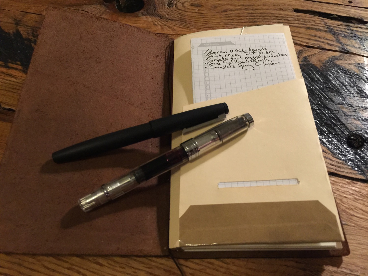
My daily Chronodex page lives in a homemade folder in my Midori, which travels with me everywhere.

My daily Chronodex page lives in a homemade folder in my Midori, which travels with me everywhere.

I take the most important tasks from Omnifocus and copy them into the Next Actions section of my Chronodex sheet. I only copy as many tasks as I think that I can realistically accomplish in the given free time that I have for the day. If I only have an hour of free time in an eight hour day, which happens quite often, I'm not going to worry about that big report that's due next month. Instead, I'm going to tackle those one or two items that absolutely have to be done by tomorrow morning. Some days I have one or two actions, and others I have five-ten.

Once my next actions are copied onto my Chronodex page, I shut my task manager down for the day and focus only on those tasks that are written down. It's a much better feeling check off all of these tasks by the end of the day, compared to that of constantly facing all of the tasks waiting for me in my task management software. I tried the Chronodex on a whim and found it confusing and hard to read at first. I wondered if a paper planning workflow could ever be anything but redundant. I'm glad that I stuck with it. After a few weeks, I can easily glance at my Chronodex and tell how much free time I have. I'm getting better at being realistic about what I can accomplish in a given day, making me more productive and less guilt-ridden about the tasks that remain.

The template that I use has a day for each side of the paper. I'm investigating more paper-efficient options.

The template that I use has a day for each side of the paper. I'm investigating more paper-efficient options.

Patrick Ng's Chronodex system is a paper tool that adds sanity to my highly-digital life. As a pen geek, I realize that sometimes I use pens and paper in ways that are less productive than using computers. This isn't one of those times. Patrick's tool has changed the way that I work and reduced the noise caused by a constant digital buzz. I'm just getting started with the Chronodex, but I plan to cover it more in the future, as my digital/analog workflow matures.

Have you ever tried to use the Chronodex or other analog system. What works for you?


Like this post? Subscribe to our rss feed or follow us on Twitter and receive new post updates automatically.