Although the winter weather has moved on, the skies are grey in the midwest this week. Grey skies always bring me back to blue and grey inks. Grey inks are my favorite shading inks, although I rarely have an opportunity to use them, and they're such an uncommon ink that they beg for a double-take when seen out in public. Although most grey inks shine in flex nibs, some of the darker inks can even be used in everyday writers, ensuring that their user has the coolest signature in the office. This week, I'm taking a look at Pilot Iroshizuku Kiri-Same ink, an ink that captures all of the best parts of grey skies and misty days.
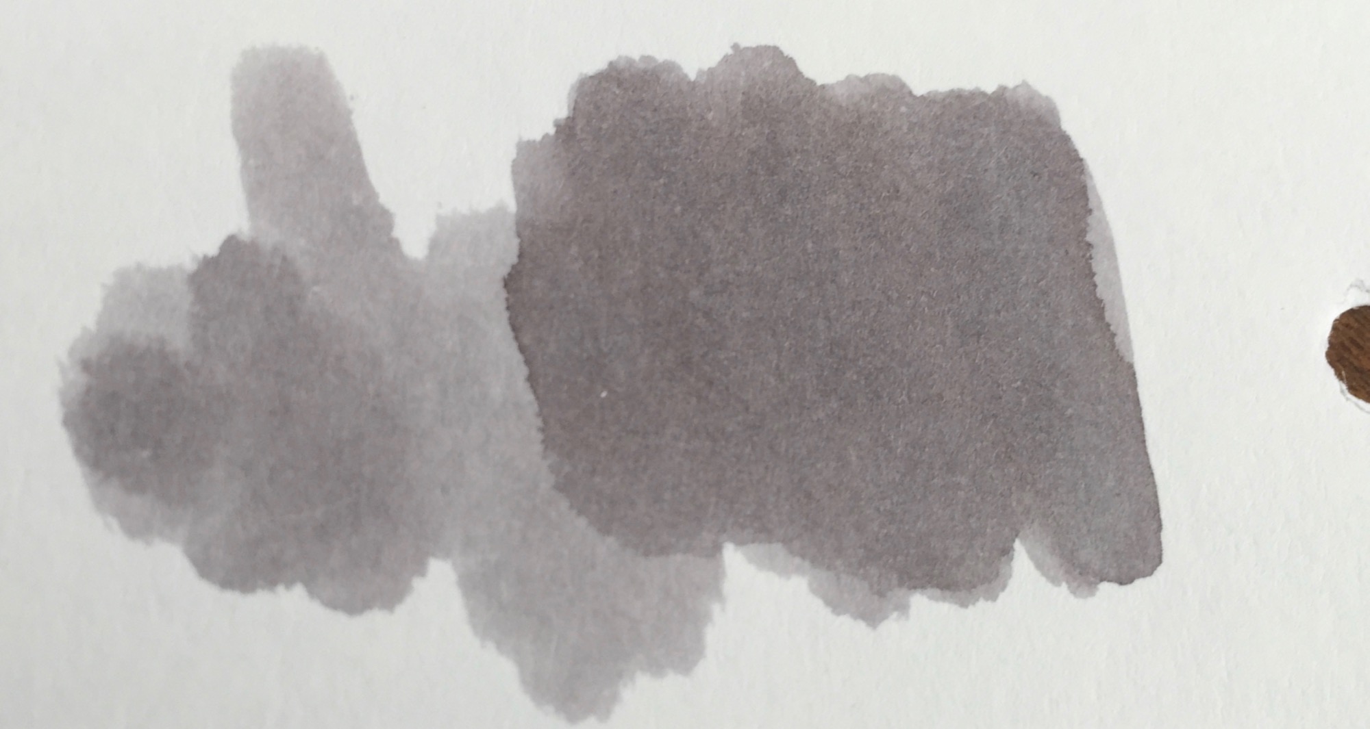
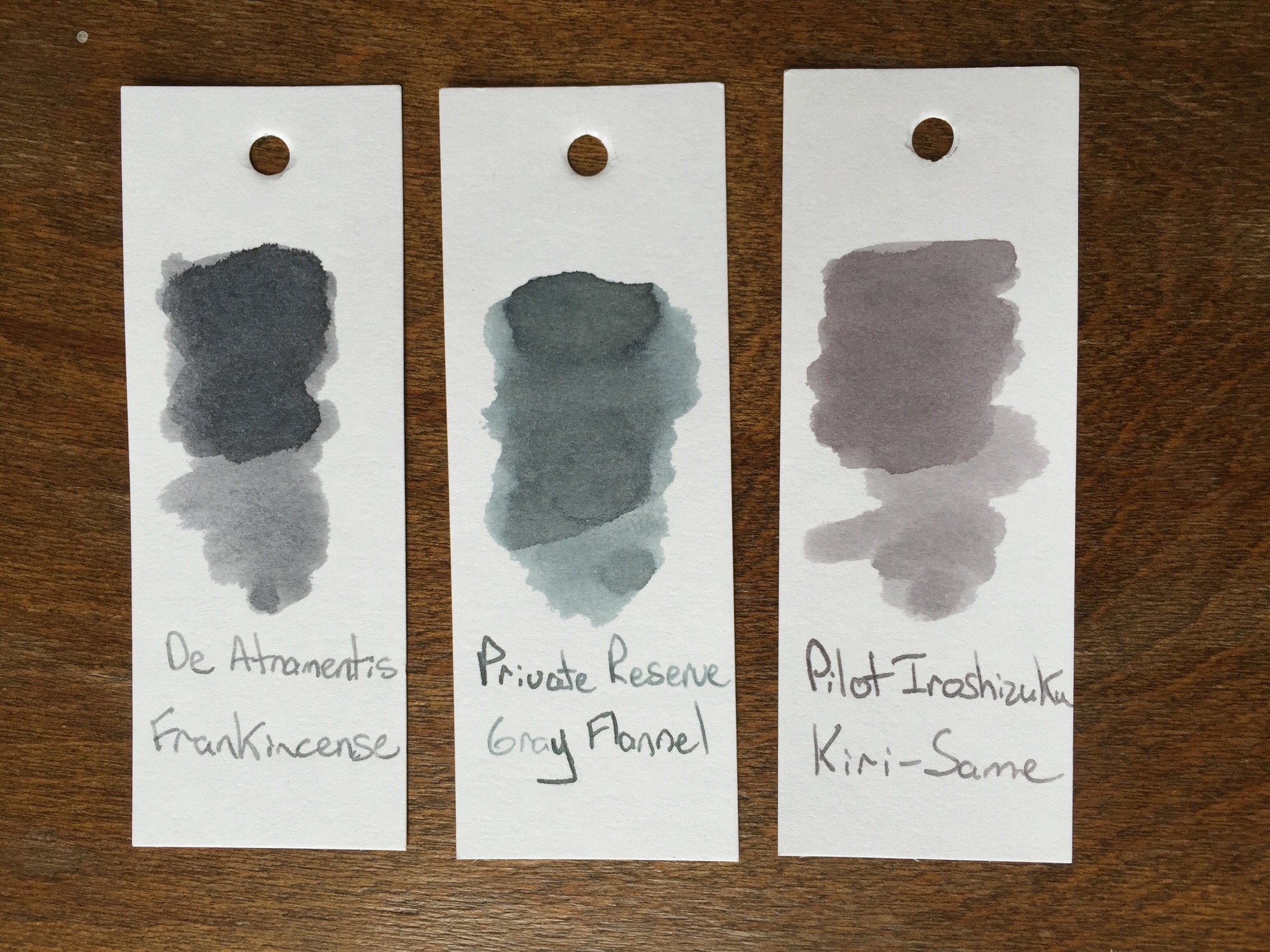
Pilot Iroshizuku Kiri-Same is on the lighter side of the grey spectrum. Just like its namesake, Kiri-Same resembles the clouds that come along with a misty rain. The ink swatch itself resembles a cloud, lighter grey around the edges with deepening shades of grey towards the center.
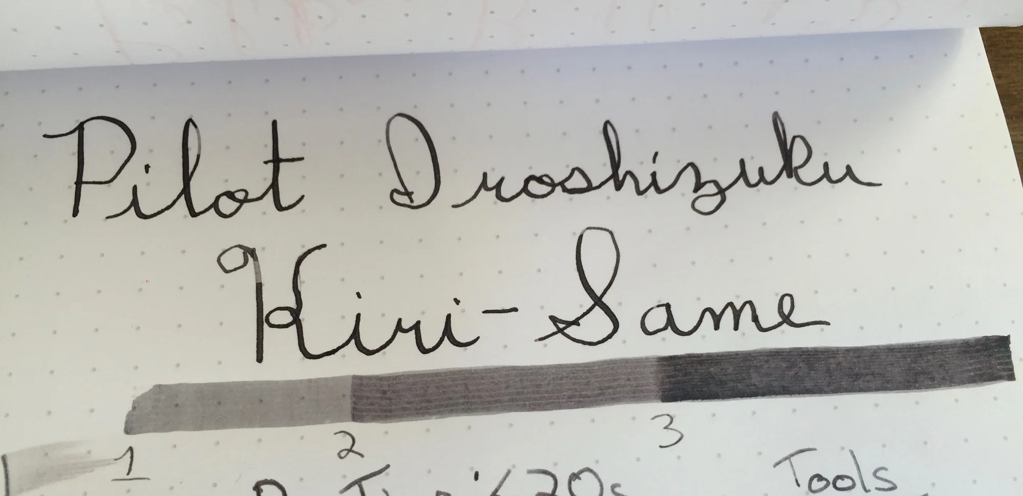
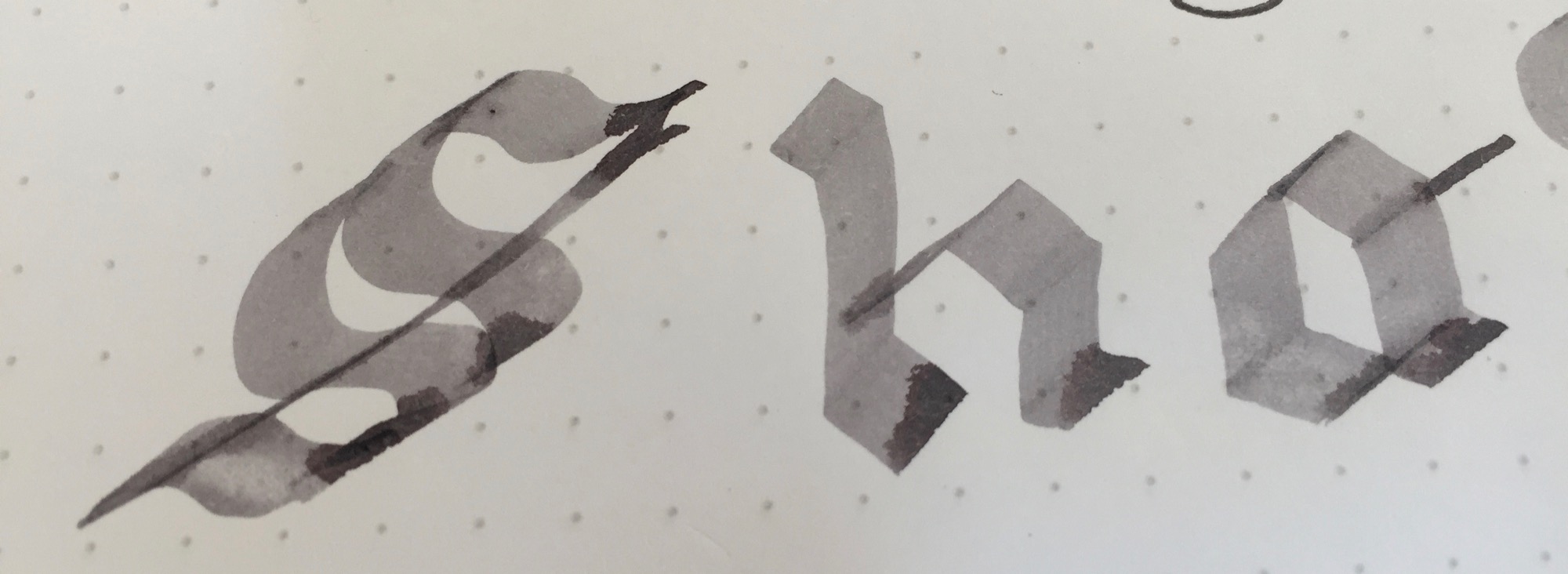
Kiri-Same is dark enough to load into your favorite fine-nibbed pen, as long as the nib tends to leave a lot of ink on the page. Since the ink's shading properties are so high, dryer nibs leave a much lighter line than their juicier counterparts. Flex or calligraphy nibs are where this ink ink belongs, and it performs splendidly in either, leaving lines which show significant color variation.
Pilot Iroshizuku Kiri-Same may come at a price premium, but its performance is well worth the price hike. Kiri-Same has a relatively fast dry time, and its shading properties make for a great sketching or calligraphy ink. With Kiri-Same, grey skies and rainy days come alive on the page.
Stats
- Dry Time: Less than 20s
- Wetness: Medium
- Shading: High
- Feathering: Low
- Saturation: High
Tools
Like this post?
Subscribe to our rss feed or
follow us on Twitter and receive new post updates automatically.
The index card is one of the most under-appreciated office supplies. It was created as a tool for organizing data and eventually became the foundation of the revolutionary Dewey Decimal System. Yes, at one moment in time, a 3x5 piece of card stock was the most powerful tool for organizing data. As digital methods of organization took over, index cards took their place on the shelf next to White-Out and typewriter ribbon. Twelve years ago, Merlin Mann unleashed the Hipster PDA into the wild, a simple index card data capture system, and lifehackers and analog lovers alike rediscovered the power of this little stationary delight. Index cards are small, versatile, and easy to shuffle and rearrange. They function well as capture devices; however, the race to the bottom has resulted in penny index cards that are flimsy and perform horribly with fountain pens.
You may know Nock Co., the creation of Brad Dowdy and Jeffrey Bruckwicki, for its creative pen cases; however, the company also produces a fine line of paper products, including its DotDash 3x5 Note Cards. DotDash refers the Nock Co.'s trademark paper grid system, that provides the best aspects of both the grid and matrix paper patterns, common among stationary products.
Nock Co.'s DotDash cards feel thicker and sturdier than the average index card. While regular index cards start to curl and bend in the sleeve of my work bag, DotDash cards stay flat. The DotDash cards are also noticeably smoother to the touch than traditional index cards. The DotDash lines are laser-sharp, while the printed lines on the traditional index cards show ink bleed and inconsistent printing. Of course, there are many different brands of index cards, but I went with the traditional stock cards form Amazon, as most would probably do when purchasing in bulk.
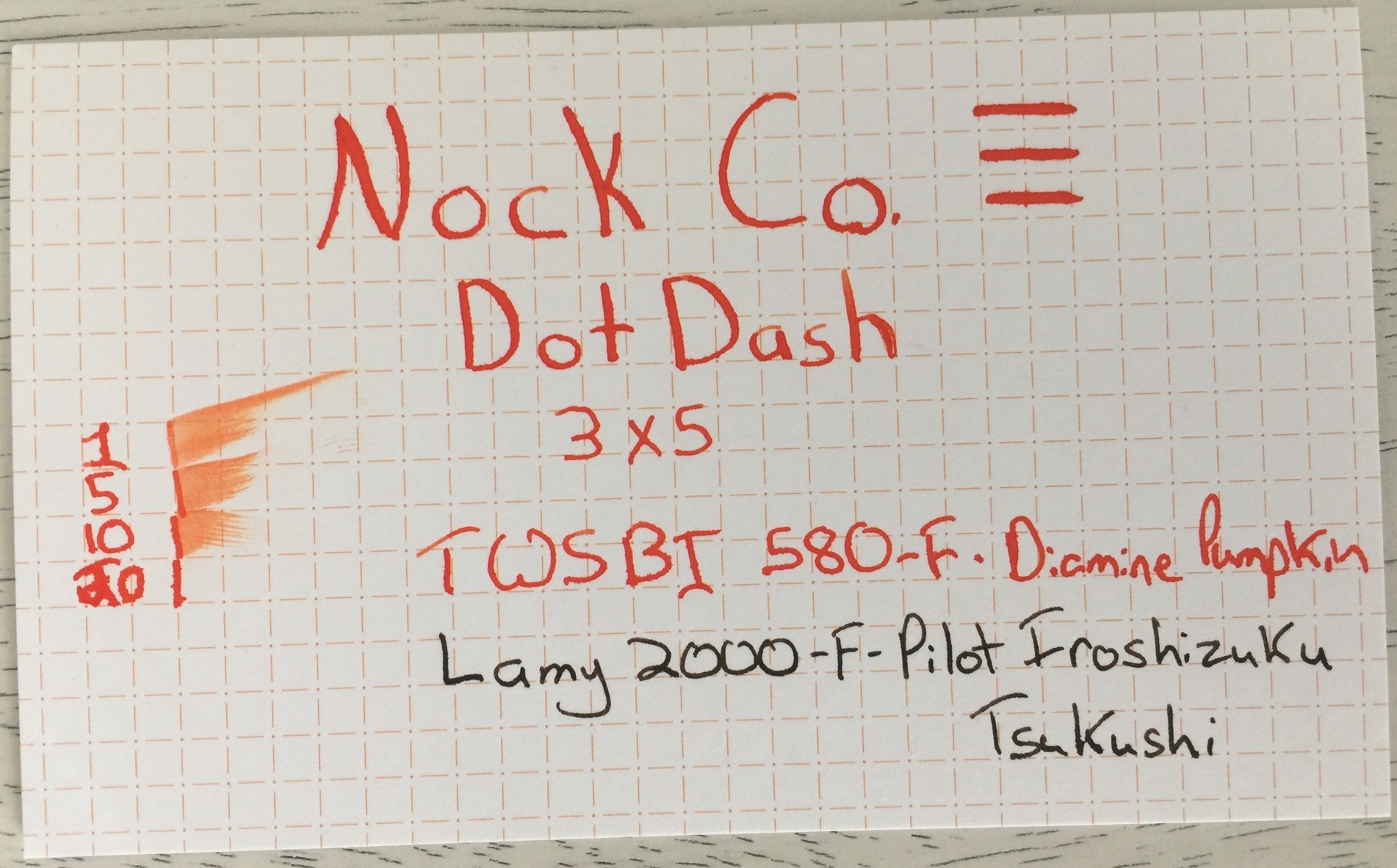
Nock Co.'s websites claim that their DotDash Note Cards "can handle almost any pen and ink you throw at it," so I pulled out my flexiest pen and favorite high-feather ink to put this claim to the test. I also used my daily carry ink and pen combo, Lamy 2000 with Pilot Iroshizuku Tsukushi ink.
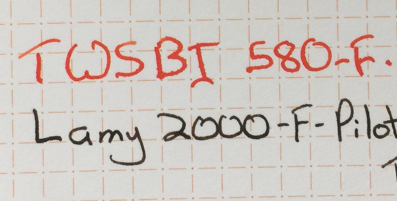
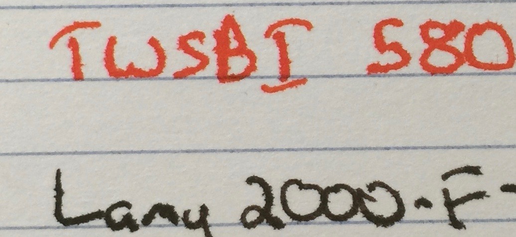
The Plain Jane index cards performed just as poorly as expected. The Diamine Pumpkin ink feathered almost as soon as it touch the paper, and even the better-behaved Tsukushi ink in my Lamy 2000 performed poorly. The card had an excellent dry time, compared to the DotDash card, but this was only because the ink feathered instantly. Nock Co.'s DotDash card performed like a champ, with minimal feathering with the 2000 and Tsukushi ink combination. Noodler's Ahab and Diamine Pumpkin ink did produce moderate feathering on the DotDash card, but it did perform significantly better than the Plain Jane card. Truth be told, I don't see myself using a flex nib on an index card, so this isn't a major concern. The TWSBI Diamond 580 is the most markedly different between the Plain Jane index cards, which perform horribly, and the DotDash cards, which shows only minimal feathering. The DotDash card performs surprisingly well, considering that Diamine Pumpkin feathers significantly on low-quality paper, and the TWSBI 580's nib leaves a very juicy line.
Nock Co. DotDash Note Cards are exceptional performers, and I keep a stack in my work bag at all times. I reach for these durable cards to jot down quotes and arrange ideas for presentations, and they hold up well to any ink and pen combo that I throw at them. At $6 for 50 cards, Nock Co.'s DotDash Note Cards haven't completely eliminated my need for the penny-per-card competitors; however, these cards are a worthy addition to any pen case or go bag.
Like this post?
Subscribe to our rss feed or
follow us on Twitter and receive new post updates automatically.
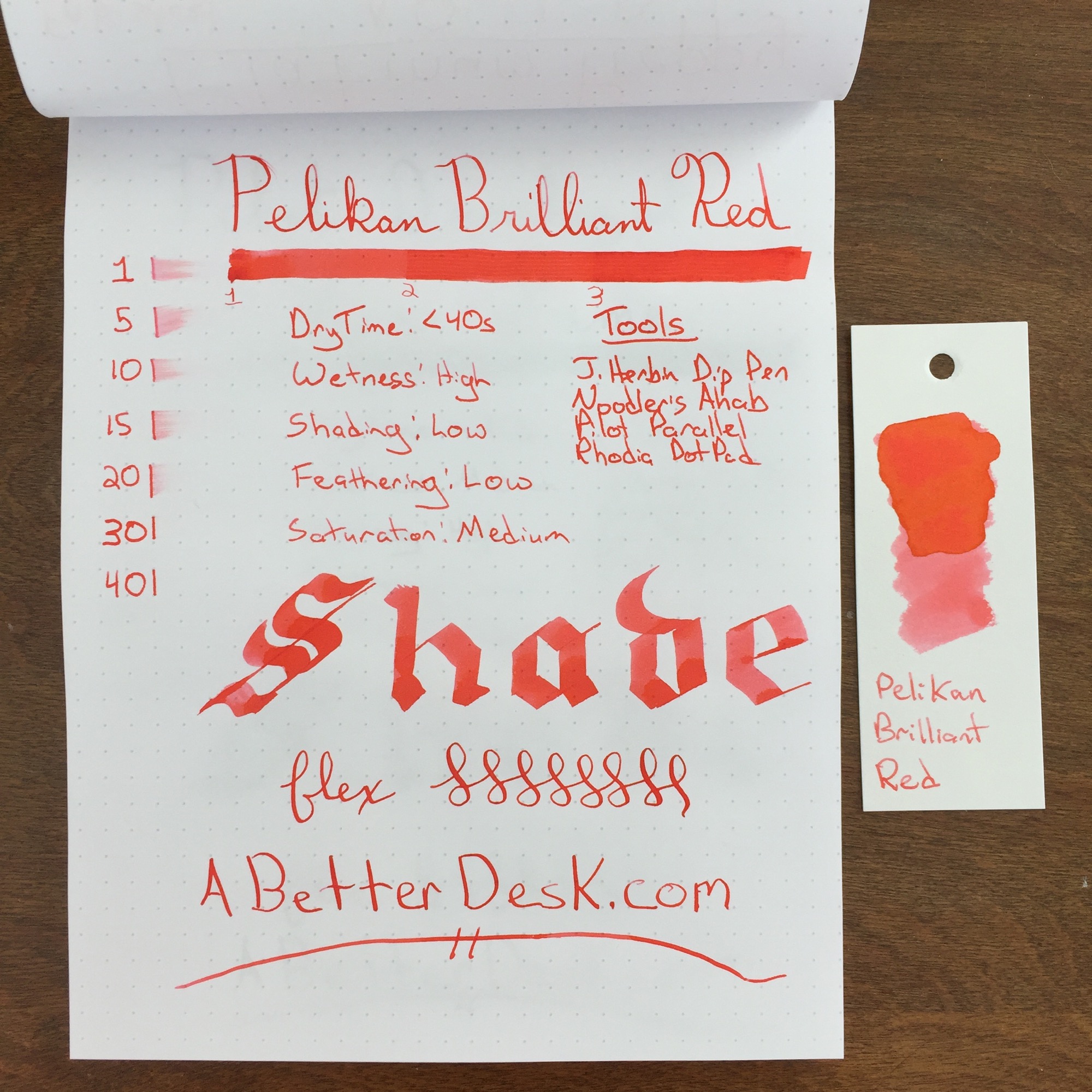
Pelikan Brilliant Red ink is aptly named. It doesn't compete with the deeper red inks, which I typically prefer; however, it is stunningly bright. The ink is complimented by the orange and yellow tones of sunset, which are subtle with regular usage, but obvious in the ink swatch.
Pelikan Brilliant Red does have subtle shading and saturation properties, but overall the ink's color was incredibly consistent, with all but my Pilot Parallel. I typically use a flex nib because I want to see color variation; however, I much prefer this ink with the thicker lines produced by the Noodler's Ahab flex nib, over a standard nib.
I noticed something peculiar when running Brilliant Red through my flex test. As the nib lay ink on the paper, the ink appear almost gel-like in consistency, as illustrated in the picture below. Perhaps this is responsible for the ink's consistent color and minimal shading properties, but I'm not sure.
Pelikan Brilliant Red ink is a solid performer for those looking for a consistent color and minimal shading. This ink is almost highlighter bright, and I think that it would work well for marking up/grading papers or calling out important bits of information. The dry time is pretty close to 30 seconds, which is on par with most inks. Although this ink isn't a personal favorite, I would happily recommend it to those who may prefer its lighter color. Personally, I'm going to stick with Red Dragon for now.
Stats
- Dry Time: Less than 40s
- Wetness: High
- Shading: Low
- Feathering: Low
- Saturation: Medium
Tools
Like this post?
Subscribe to our rss feed or
follow us on Twitter and receive new post updates automatically.
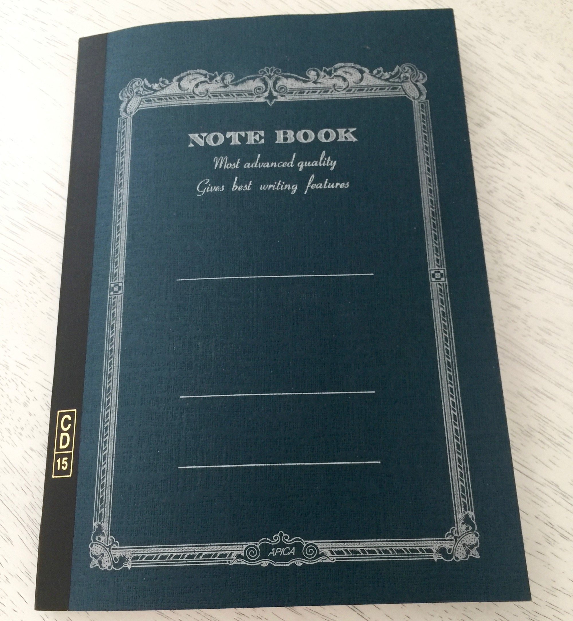
Walk into any Japanese convenient store and you're likely to find a variety of pens and high-quality paper. Campus notebooks are one of the most common brands. These thin notebooks come in various sizes and are sturdy enough for the average Japanese student on-the-go. Between two to four dollars in Japan, these 68 page delights are accessible, even on the smallest of student budgets.
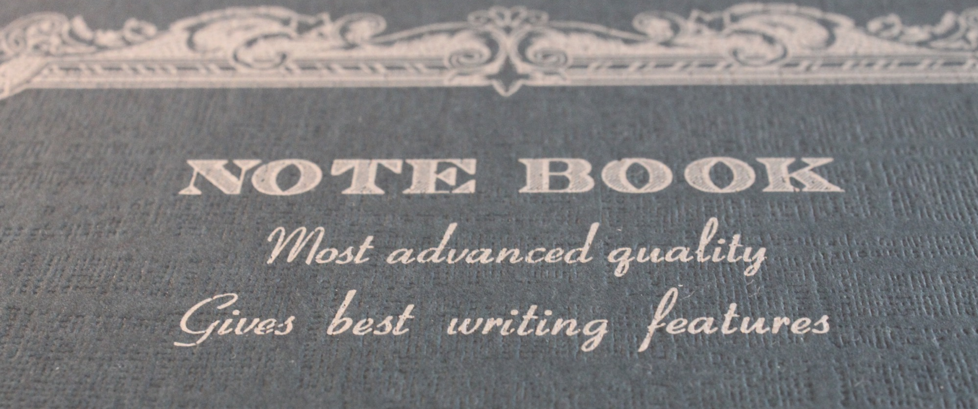
The Apica CD15 notebook is a 68-page B5-sized notebook with personality. Apica notebooks are a slightly upscale version of the Campus notebook, and the slogan on the notebook cover says it all, "Most advanced quality. Gives best writing features." Awkward translations are common in Japanese paper goods and add a sense of playfulness and whimsy. The notebook is thread-bound, with sturdy binding tape to protect the spine. The cover is made of heavy cover stock, with a rough-textured surface.
It's hard to imagine walking into a convenient store to pick up fountain pen friendly paper, but Apica's paper is thick and works very well with a range of fountain pens and inks. While there is no visible bleed through, thicker nibs and certain inks do cause a light to moderate amount of feathering, but I'm very pleased with the paper's performance.
I've tested multiple notebooks of various sizes and paper types, and I'm in love with the 68 page B5 format of this notebook. The paper size is large enough for substantial writing projects, but the small page count makes the notebook very portable and reduces my notebook completion anxiety. The Apica CD15 notebook is a fantastic find. I use the notebook to draft all of my blog posts and continue to do so for the foreseeable future.
Like this post?
Subscribe to our rss feed or
follow us on Twitter and receive new post updates automatically.
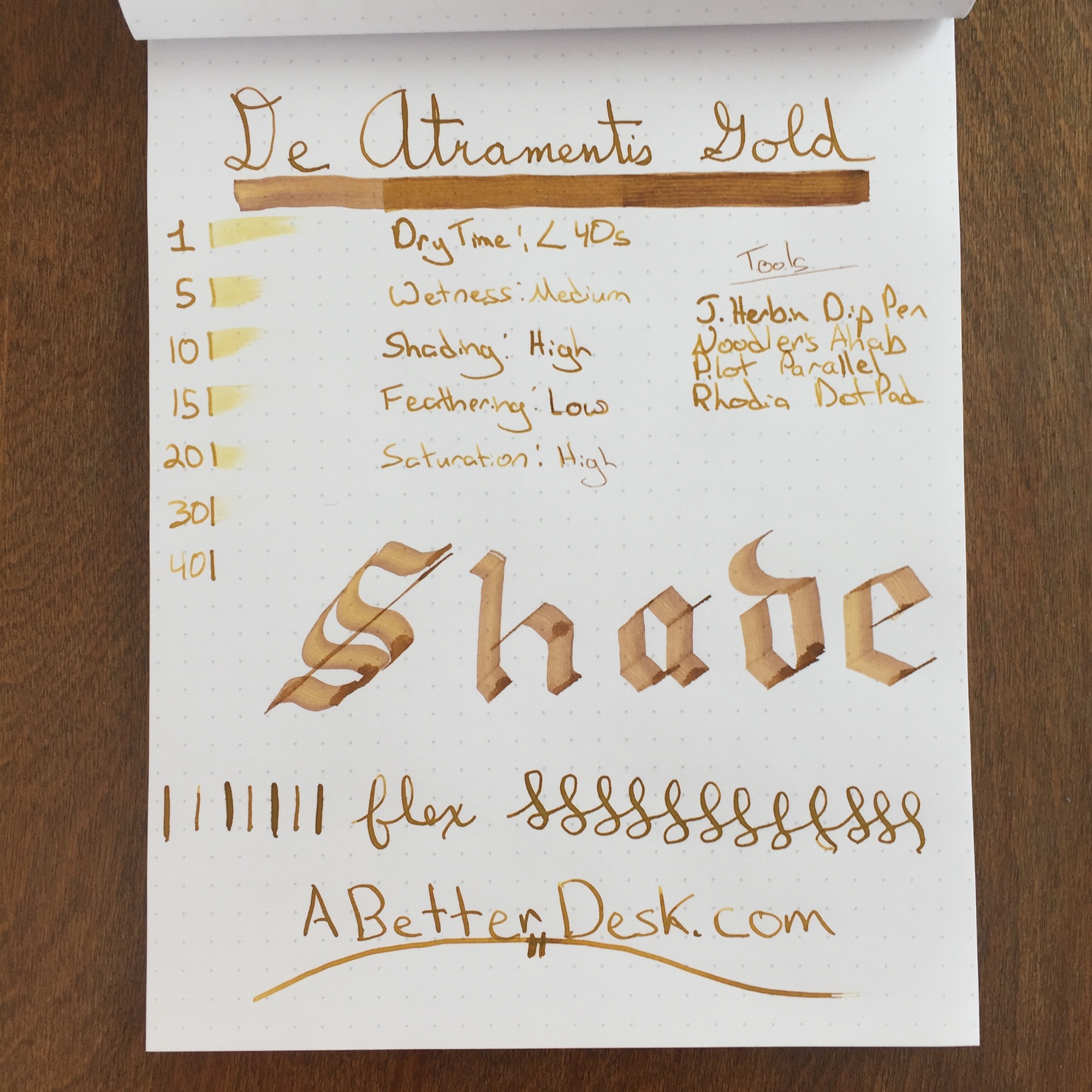
Everybody needs ink with a little bling every now and then. Whether you're signing your Vegas marriage certificate or sketching the piles of money that you plan to make by selling the epic novel that sits unfinished on your desk, there's no better color than gold to emphasize extravagance and luxury. De Atramentis Gold may just be the color that's worthy of illustrating your imagined success.
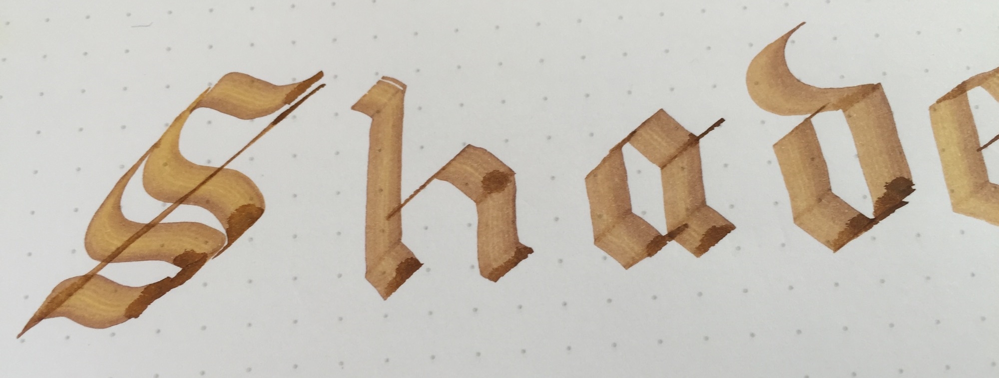
De Atramentis Gold looks like liquid gold on the page and is somewhat thicker than typical fountain pen inks. This is hard to see with a finer nib, but it's obvious with my Pilot Parallel. While most inks fill in the channels left from the serrated edges of the Parallel's nib, De Atramentis Gold stays in place, leaving noticeable stripes on the page. The ink dries in less than 40 seconds with a fine nib, which is longer than a typical dry time of 20 to 30 seconds. This probably isn't going to be an everyday carry ink, so a longer dry time isn't a detriment.
I chose De Atramentis Gold to review this week since I've grown a bit bored with traditional colors. I can't say that I plan to use it daily, but I was pleasantly surprised by the ink's true golden color and solid performance. All kidding about extravagance and luxury aside, this ink is an excellent inexpensive choice if you're looking to give one of your prized pens the Midas touch.
Stats
- Dry Time: Less than 40s
- Wetness: Medium
- Shading: High
- Feathering: Low
- Saturation: High
Tools
Like this post?
Subscribe to our rss feed or
follow us on Twitter and receive new post updates automatically.

